What is a responsive website design?
A responsive website design, also known as mobile friendly website, is an approach to designing websites where the display is automatically optimised across a range of devices. This includes everything from desktop computer monitors to game consoles and TV’s to mobile phones, and is a cost saver compared to having a mobile application created or multiple versions of your website targeted towards different devices.
This design element is achieved by creating a fluid grid that shifts and adjusts the page elements relative to the screen output size. As a result you need to make sure elements like images and buttons are still usable and not too small or too large on each devices output.
Benefits of a Responsive Website Design
- Streamlined experience across devices
- Positive ranking signal
- Improve mobile conversion rate
- Improved user experience
- Faster download speed
- More flexible and cost-effective than app development
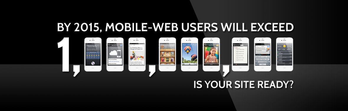
How’s your online ranking now?
Since the April 21 release of Google’s new ranking algorithm includes checking for mobile friendly or responsive website design capabilities. As a result many businesses who didn’t prepare and have not yet made adjustments will notice changes in their search engine rankings. This once optional website design elements is not mandatory if you want to seriously take your business into the future.
Reduce your visitor bounce rate
Many smart phone visitors won’t even take the time or put in the effort to try and browse through a website that isn’t formatted for mobile devices. And honestly, why should they?
Your mobile Health check
- Does it draw your eye to your key selling points or message?
- Is the content easy to read?
- Is it easy to navigate?
- Is it easy to recognize and activate the call to action?
- Does it provide a good user experience?
- Is it a website you would spend time if it was not your own?
If you mostly answered “no”, then it’s time to optimize your mobile site and capture the traffic and sales you’ve been missing out on.
Mobile shopping is increasing dramatically.
Online shoppers have quickly grown accustomed to buying online using their mobile devices. As a business you want to make it as simple as possible for people to spend money in your store, and in order to achieve this the mobile experience must be positive.
Responsive website design is the future
So along with keeping in mind that current trends are only that, if you want to compete online you need to have an online strategy that is agile and can grow as your online customers’ needs grow.
[/vc_column][/vc_row]